
matplotlibを用いて棒グラフを描画する方法を整理しました。
グラフ領域の生成にはsubplots
を使用し、tkinterを用いて表示を行っています。subplotsの使用方法はこちら、tkinterにグラフを表示させる方法はこちらをご覧ください。
【スポンサーリンク】
縦・横方向棒グラフの表示方法
棒グラフを表示させるには、bar(縦棒グラフ用)
またはbarh(横棒グラフ用)
を使用します。
縦棒グラフと横棒グラフを並べて表示させる例を以下に示します。17~19行目でsubplots
を用いてグラフ領域を横並びでニつ生成し、それぞれに縦棒・横棒グラフを設定しています。
How to create bar graph by matplotlib
実行すると、画面左側に縦棒グラフ、右側に横棒グラフがそれぞれ表示されます。
【スポンサーリンク】
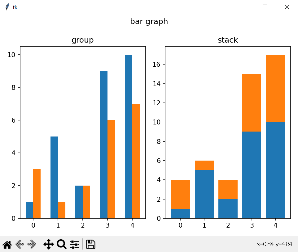
複数の棒グラフを同じグラフに表示(グループ・積み上げ)
複数のデータをグループ化または積み上げて一つのグラフ領域内にまとめて表示させる方法をまとめました。以下の例では、グループ・積み上げそれぞれの棒グラフを横並びで表示させています。
二つの棒グラフをグループ化して表示するには、それぞれの棒グラフに対して棒の幅分だけ位置(x座標)をシフトさせる設定を行う必要があります。以下の例では、棒の幅(width
)を0.3に設定し、その半分の値だけ二つのグラフを左右にシフトすることで並べて表示させています。(21~23行目)
二つの棒グラフを積み上げて表示するには、上側に表示させるグラフの位置(y座標)を下側の棒グラフのy値分だけ底上げさせる必要があります。その場合は、棒グラフのオプションbottom
に底上げする値(以下のケースではy_1)を設定します。(25~26行目)
How to create group or stack bar graph
実行すると画面左側にグループ化された棒グラフ、右側に積み上げ棒グラフが表示されます。
【スポンサーリンク】
オプション一覧
よく使用されるオプションの表と具体的な使用例を以下に示します。
| オプション | 説明 |
|---|---|
| tick_label | 横軸の項目設定 |
| data | 辞書型やPandasのDataFrame型データ用 |
| color, edgecolor | 棒グラフの塗りつぶし、外周線色の設定 |
| width | グラフ幅の設定 1で隣接グラフ間の隙間なし |
| hatch | ハッチングの設定 |
| yerr, xerr | エラーバーの設定 |
様々なオプションを使用して棒グラフを表示させた例を以下に示します。

【スポンサーリンク】